Our Brand
Our brand system visually communicates our values, who we are,
what we do, and why we do it.
Our Logo
Rounded shapes of various size and color are fused together within two interlocking C's, creating a collection of segments that come together as complementary and continuous - a continuum.
Our Colors
Our primary color palette pulls from legacy DATIS, Welligent & CaredFor brands to create a spectrum that is familiar, warm, approachable, and confident, reflecting our brand personality and voice.
Templates
Our letterhead and powerpoint templates serve as a guideline so that we can provide a professional and cohesive brand experience for both internal and external-facing documents and presentations.
Brand Story
The ContinuumCloud brand is all about energy, efficiency, and expertise. The Energy in our brand is driven by a primary focus on people images presented with pops of color, including our signature orange and teal, as well as graphics that depict circular movement and velocity. The Efficiency is represented in our simplistic yet impactful design style. Just like our products, we don’t overcomplicate. Our brand simplifies complex ideas and makes them easy for everyone to understand. The Expertise comes out in our brand voice, which is compassionate, confident, and solution-oriented – we know your industry, we know your challenges, and we have proven solutions that we know can help you.
Who We Are
About ContinuumCloud
ContinuumCloud offers a spectrum of cloud-based software solutions intentionally designed to meet the unique needs of the behavioral health and human services industry. These solutions include an EHR platform, powered by Welligent; an HCM system, powered by DATIS e3; and a patient engagement platform, powered by CaredFor. Through these offerings, ContinuumCloud empowers organizations to provide high-quality care and deliver on their mission.

Who We Serve
Behavioral Health & Human Services Organizations
Our clients’ missions are to serve their communities by providing a vast spectrum of services for behavioral health, substance use, homelessness, intellectual and developmental disabilities, children and families, veterans services, and many more. Our clients serve more than 5,000,000 children and adults annually, across more than 40 states. We're building software solutions designed to help them better achieve their mission.
Find out more about ContinuumCloud’s history and solutions in this overview.
SLOGAN
A Spectrum of Solutions for Social Good
ONE LINER
A spectrum of software solutions intentionally designed
for the behavioral health and human services industry.
Logo
Rounded shapes of various size and color are fused together within two interlocking C's, creating a collection of segments that come together as complementary and continuous - a continuum. DATIS, Welligent, and CaredFor logos feature the ContinuumCloud endorsement.
Logo Usage
Please use the ContinuumCloud logo when the resource or presentation features all three products or focuses on the overall ContinuumCloud brand (i.e. town hall meetings, recruiting initiatives, social media, etc). Please use product logos when the piece is specific to a certain product (i.e. product training resources, client webinars, sales outreach for a specific product, etc).
Logo Color
Our primary logo is the navy logo on a white background. Our alternate, all-white logo is to be used on darker backgrounds.
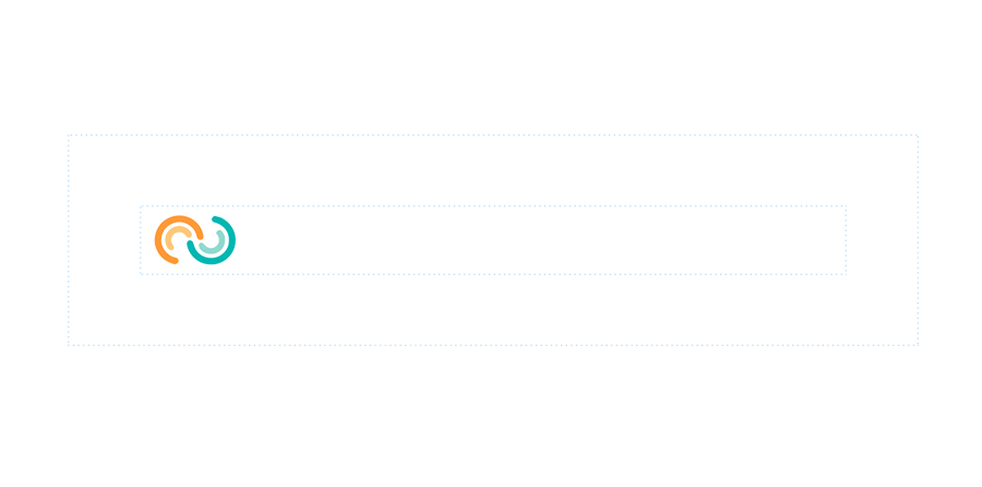
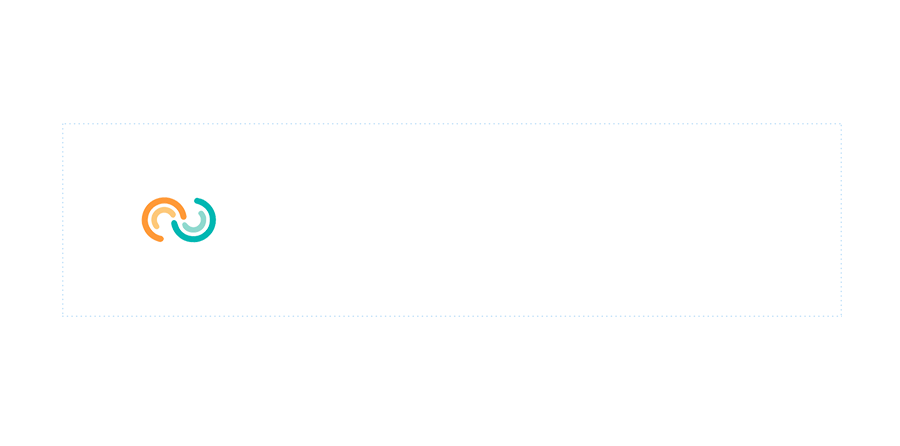
Logo Safe Zones
The safe zone for the ContinuumCloud logo can be determined by positioning the logomark as pictured below. This is the minimum safe space between the logo and other elements, or even the canvas, to keep an optimal visual integrity.
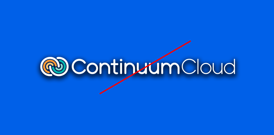
Logo Misuse
The appearance of the logo should be consistent.
DO NOT use custom colors, custom background, gradients or shadows
DO NOT stretch the logo, change the letter spacing or thickness of letters
DO NOT place overlapping elements behind or in front of the logo
DO NOT use the logo as a mask
DO NOT change the logo’s orientation
DO NOT apply any effects to the logo except for use in logo bumper animations
Colors
Primary Colors
Our primary color palette is warm and approachable, reflecting the values that DATIS holds. DATIS Orange is to be used as a highlight or callout. Navy blue (#002447) may be used for copy on a light-colored background, or alternatively as a solid color block on which to place light-colored copy.
#002447
#FFFFFF
#FF9937
Primary Colors
Our primary color palette is confident, warm, and approachable, reflecting the ContinuumCloud brand personality. DATIS Orange and Welligent Teal are to be used as a highlight or callout. Indigo (#003C75) may be used for copy on a light-colored background, or alternatively as a solid color block on which to place light-colored copy. Burnt Sienna should be used similar to Welligent Teal and DATIS orange for highlights or accents, but never for call to actions.
Indigo
- #003C75
- RGB 0 60 117
- Primary
Welligent Teal
- #00B8B3
- RGB 0 184 179
- Primary
DATIS Orange
- #FF9937
- RGB 255 153 55
- Primary
Burnt Sienna
- #E45E40
- RGB 228 94 64
- Primary
Secondary Colors
The secondary color palette acts as a set of options complimentary to the primary palette for use in certain situations. Our DATIS orange or Welligent Teal gradients can be used as a background color, or in addition to our primary color palette to make certain content, CTAs or UI components to stand out. Light blue #BEDEFD is to be used as a highlight sparingly. Navy #002447 is to be used as a complimentary dark background, secondary to Indigo #003C75.
#FF9937
#F47C20
#DEEFFF
#003C75
Light Blue
- #BEDEFD
- RGB 190 222 253
- Secondary
Light Teal
- #8FD9CE
- RGB 143 217 206
- Secondary
Light Orange
- #FEC879
- RGB 254 200 121
- Secondary
Navy
- #002447
- RGB 0 36 71
- Secondary
Tertiary Colors
The tertiary color palette acts as a set of options complementary to our primary and secondary palette for use in certain situations. Light gray can be used as a background for copy or graphics in place of pure white. Pumpkin can be used in tables and charts as an alternate for DATIS Orange or used as a gradient. Light blues can be used sparingly in infographics, charts, or gradients.
#F47C20
#F5BE76
#F4F4F4
#E3E3E3
#BEDEFD
#003C75
Pumpkin
- #F47C20
- RGB 244 124 32
- Tertiary
Slate
- #455A64
- RGB 69 90 100
- Tertiary
Platinum
- #E3E3E3
- RGB 227 227 227
- Tertiary
Charcoal
- #7F7F7F
- RGB 128 128 128
- Tertiary
Sky Blue
- #90C8FF
- RGB 144 200 255
- Tertiary
Cobalt
- #0047BB
- RGB 0 71 187
- Tertiary
Typography
Poppins Bold
Lorem ipsum is placeholder text commonly used in the graphic, print, and publishing industries for previewing layouts and visual mockups.
Pairings
It is important to maintain these type pairings. This allows for clarity, consistency, and a strong hierarchy for all communications.
Poppins Bold 700 is used for headlines
Poppins Regular 400 is used for body copy
Poppins Bold 700 is used for headlines
Poppins Medium 500 is used for subheadlines
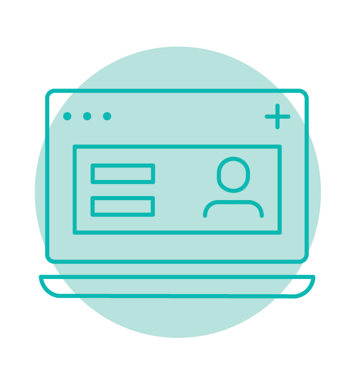
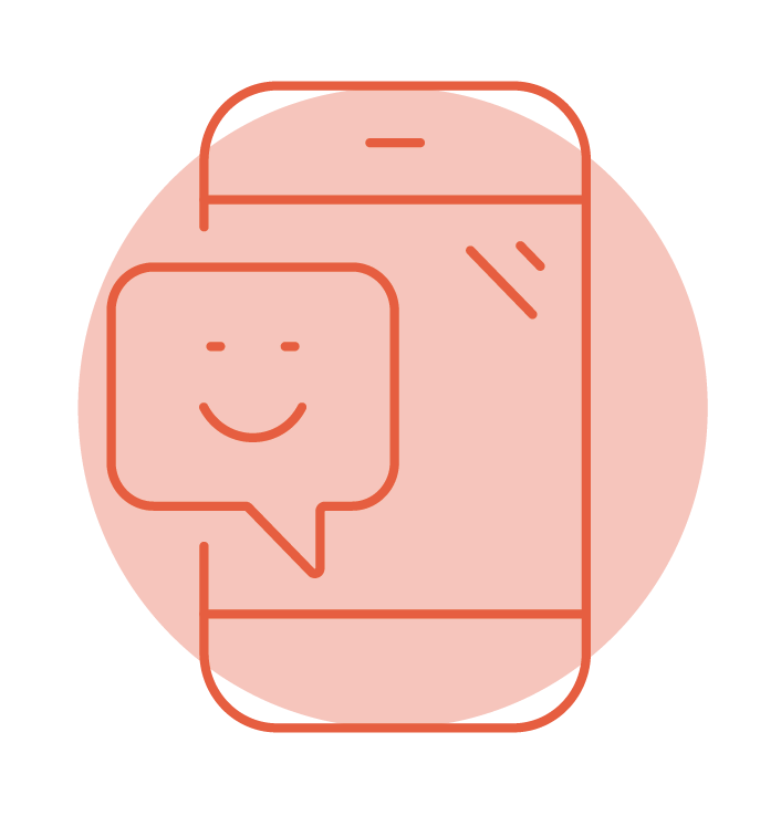
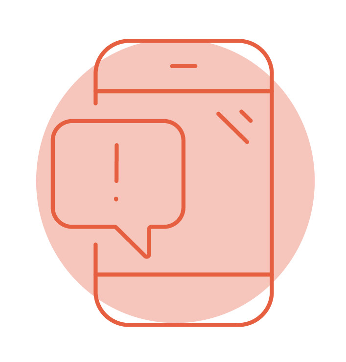
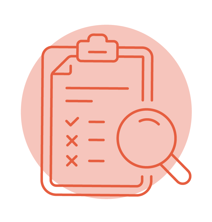
Iconography
Solution Icons
Solution icons promote software capabilities and features, and can be used for in-app navigation.
Position Control
HR Management

Recruiting Management
Time & Attendance

Payroll Processing
Benefits Administration
Talent Management
Business Intelligence

Clinical Care Management

Billing & Revenue Cycle

Mobile EHR Capabilities
Telehealth & Messaging
Internal Chat
Patient Portal

Surveys & Engagement

Reporting & Outcomes
Peer Support Community

Messaging & Reminders
Content Library

Surveys & Events

Personalized Care Journeys

Digital Interventions
Surveys & Custom Reports
Family & Alumni Programming
Photography
Our photography focuses on people, rather than technology. Images should be clearly "people first" and "tech second", ensuring that happy, motivated, and engaged people are the focus of the photo, and the technology or device that enables them is a secondary element. The images should inspire our audience and communicate how ContinuumCloud solutions can make work feel more enjoyable and fulfilling.
How we express the brand in images

Interactions
Express collaboration

Compositions
Open with negative space

Casting
People are relatable

Lighting and Color
Appears neutral

Locations
Express freedom

Technology
Demonstrate app platform
Social Media
Use the below assets for quick uploading to social media platforms.
LinkedIn Banner
Version 1
LinkedIn Banner
Version 2
Facebook Banner
Video Sharing Backgrounds
Use the below assets for backgrounds on Zoom, GoToWebinar, Teams, etc.

ContinuumCloud
Welligent
DATIS

CaredFor